Cura
Usability test report.
Two moderated rounds with eight different participants tested whether medication setup, daily dose actions, and late-dose recovery were clear without instruction.
- Moderated Testing
- Prototype Testing
- Interaction Design
- Design Iteration
The first round revealed what the interface was hiding.
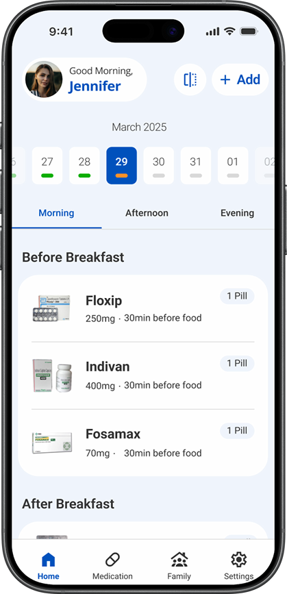
The daily schedule depended on people interpreting progress bars, discovering a swipe gesture, and recognizing time-window tabs without explanation. I changed those interactions, then tested the revised prototype with four different people.
About this reportThis page uses the findings currently recorded in the Cura project. It does not add participant demographics, verbatim quotations, SUS scores, exact scripts, or per-task timing because those details are not present in the portfolio record.
Two rounds, two different groups.
Each moderated remote session covered the same core experience: medication setup, the daily schedule, marking a due dose as taken, and recovering from a late dose.
Round one exposed the friction
Four participants used the original interactive prototype. The interface relied on several signals that made sense only after they were explained.
- Calendar progress bars were not understood.
- Nobody discovered swipe-to-complete without instruction.
- Time-window tabs looked like filters.
- Separate Add and Scan actions created hesitation.
Round two tested the response
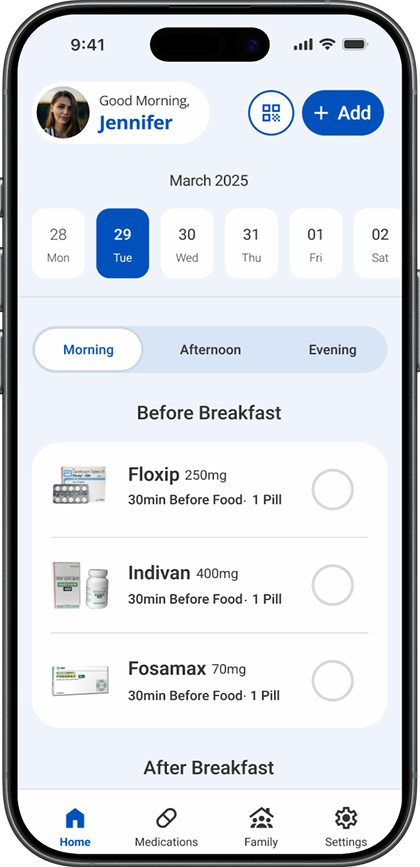
Four different participants used the revised prototype. The goal was to see whether visible controls and a clearer hierarchy removed the earlier dependence on explanation.
- Swipe became a visible tap control.
- Completion feedback moved beside each medication.
- Time-window tabs gained size and contrast.
- Add became one entry point, with Scan inside.
One interaction produced the clearest before-and-after result.
The hidden swipe failed discovery in round one. After it became a visible tap control, every participant in the different second-round group completed it correctly.
Discovered swipe-to-complete without instruction in round one.
Completed the visible tap interaction correctly in round two.
Participated across two rounds, with a different group in each round.
What testing changed.
Every retained observation is paired with the design response it caused and the result the current project record can support.
| Observed | Changed | Result |
|---|---|---|
| Calendar progress bars were not understood without explanation. | Removed the bars and moved completion feedback beside each medication. | The final screen no longer asks people to decode an unexplained calendar signal. |
| Nobody discovered swipe-to-complete without instruction. | Replaced the hidden swipe gesture with a visible tap control. | All four participants in the next round completed the interaction correctly. |
| Morning, afternoon, and evening tabs were mistaken for filters. | Increased their size and contrast while preserving time windows. | The final control gives each time window stronger navigational emphasis. |
| Separate Add and Scan actions created hesitation. | Kept one Add entry point and placed Scan inside the flow. | The entry point now asks for one decision before showing input methods. |
What the evidence can support.
The report is specific about what was observed and equally clear about what the current record does not contain.
Confirmed and included
- Two moderated remote rounds with four different people in each round.
- Eight participants total, managing or expecting to manage recurring medication.
- The setup, daily schedule, dose-completion, and late-recovery scenarios.
- The four observed usability issues and their design responses.
- The 0-of-4 to 4-of-4 result for the primary completion interaction.
Not added to the record
- Participant names, detailed demographics, or individual profiles.
- Verbatim participant quotations or session transcripts.
- Per-participant task times, error counts, or assistance logs.
- A System Usability Scale score or statistical significance.
- Claims that the other three changes achieved a measured completion rate.
What I would validate next.
A future round would preserve the same core scenarios while recording the behavior consistently and testing Cura in the routines where medication decisions actually happen.
- Use one task protocol.Give every participant the same setup, due-dose, and late-recovery scenarios.
- Capture assistance and errors.Record when someone pauses, chooses the wrong control, or needs an explanation.
- Test the full state model.Confirm that upcoming, due, late, taken, and missed remain distinct across the day.
- Run a longer pilot.Study whether the interface still feels clear when routines change over several days.
Testing made the action visible.
The strongest result was not a preference score. It was a behavior change: nobody found the hidden gesture in the first round, and every participant in the different second-round group completed the visible replacement correctly.