Cura
How do you remind someone without making them feel judged?
A medication support system that replaces rigid, exact-time alarms with flexible time windows, recoverable dose states, and caregiver visibility that only appears when it actually matters.
- Research Synthesis
- Information Architecture
- User Flows
- Dose-State Logic
- Prototyping
- Usability Testing
Exact-time alarms assume medication fits a fixed schedule. In practice, doses get taken around meals, sleep, and work, and a single missed alarm can feel like a moral failure instead of a recoverable moment.
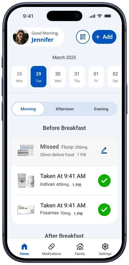
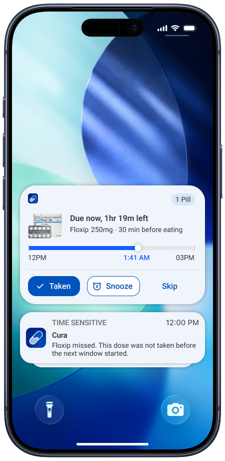
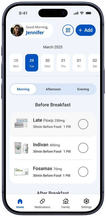
Cura replaces that fixed schedule with one shared dose-state model (upcoming, due, late, taken, or missed) so timing bends to the routine instead of the other way around.
Key data: research and testing findings
Completed the fixed interaction
After the hidden swipe gesture was replaced with a visible tap toggle, every participant in the next testing round completed it correctly.
Used no reminder app at all
13 of 18 survey respondents managed medication without any dedicated reminder tool before this project.
2 rounds: moderated usability testing.Four participants each, covering setup, the daily schedule, and dose recovery.
Problem → solution overview
Three research conclusions shaped the state model and interface.
Exact-time alarms fought real routines
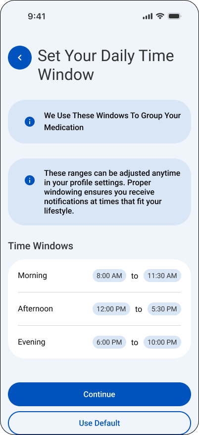
Replace fixed alarm times with flexible time windows tied to when doses actually happen: around meals, sleep, and work.
Late and missed felt like the same failure
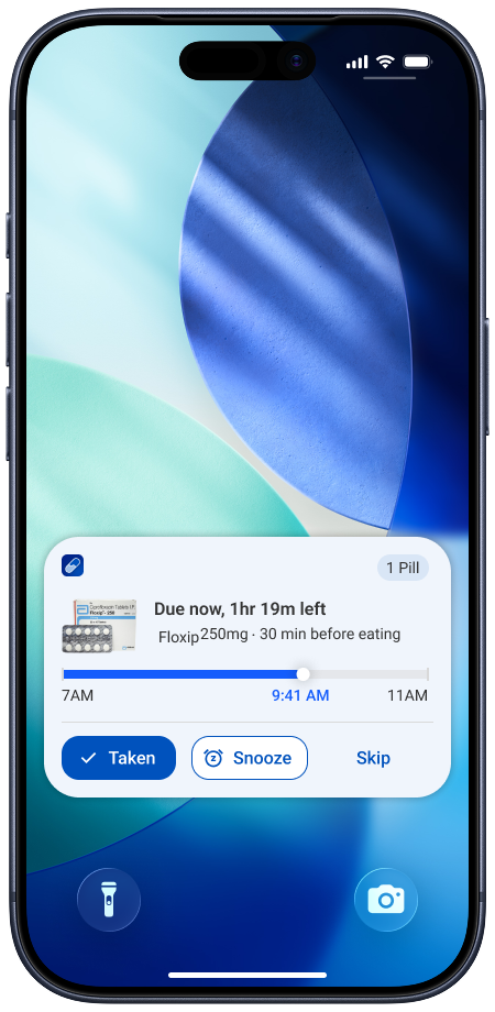
Split the state model into upcoming, due, late, taken, and missed, so a recoverable moment does not trigger the same alarm as a missed one.
Caregiver visibility felt like surveillance
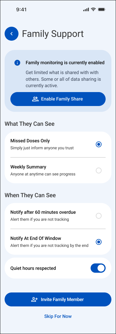
Show caregivers only meaningful exceptions instead of constant monitoring, with consent built into setup.
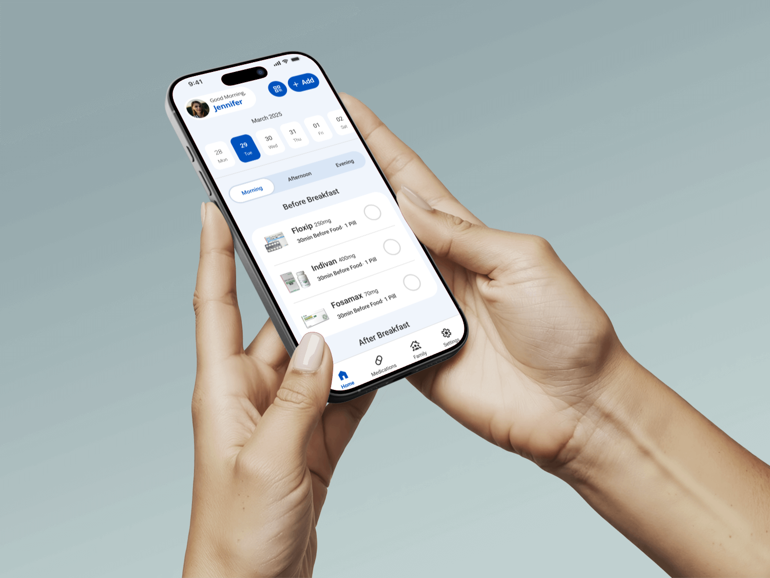
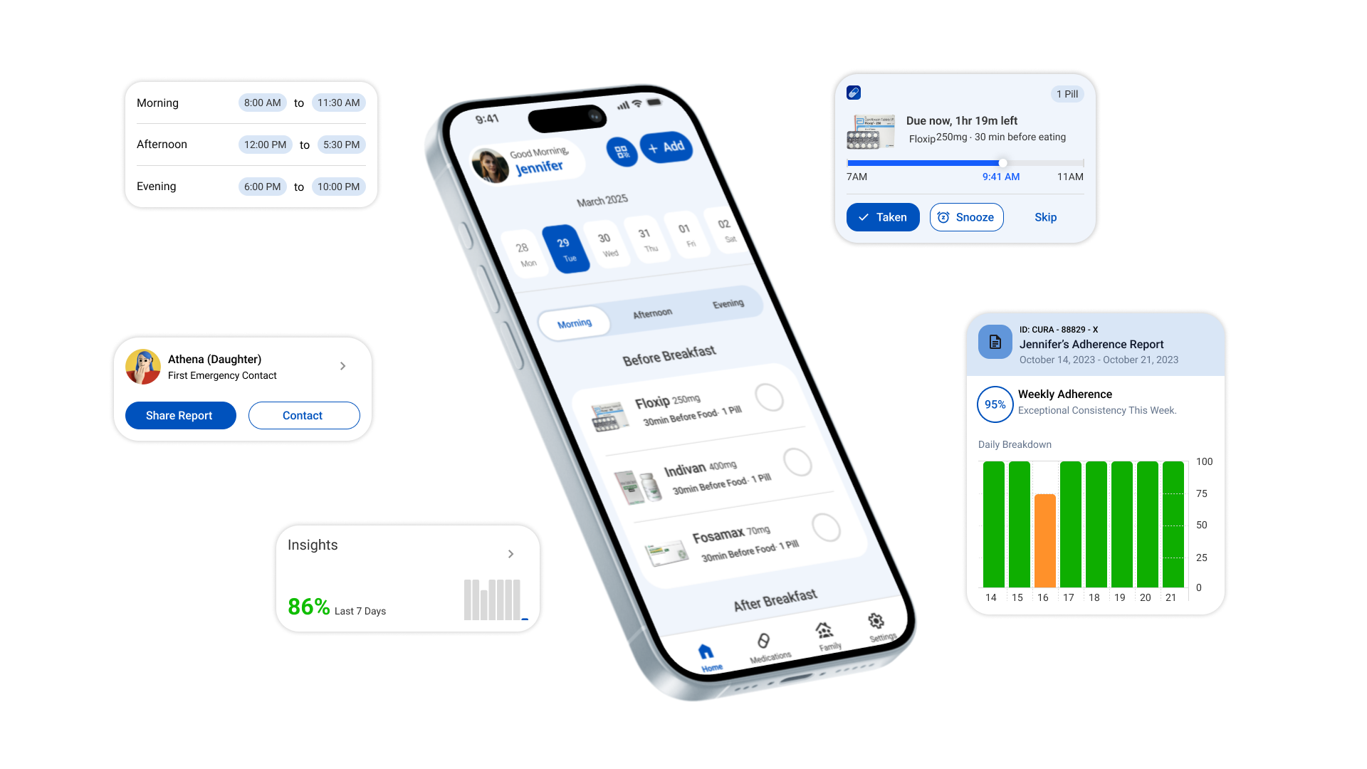
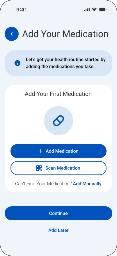
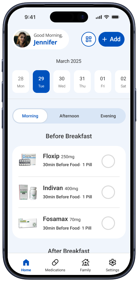
The final prototype.
One shared dose state, surfaced differently for the person taking medication and the caregiver supporting them.
Contributions
The work combined behavioral research, state-model definition, interaction design, and usability testing.
Learnings
Three lessons changed how the final system was framed and designed.
Research and synthesis
Ran a survey and interviews, then synthesized adherence behavior into the flexible time-window concept.
A hidden gesture is not a control.
Swipe-to-complete felt natural to design, but no participant discovered it without being told. Every meaningful action needs a visible, discoverable control.
System and states
Defined the upcoming, due, late, taken, and missed dose states shared across every screen.
Timing should model behavior, not the clock.
Exact-time alarms fight how people actually take medication, which happens around meals, sleep, and work, not at a fixed minute.
UX/UI and testing
Designed the wireframes and visual interface, then ran two rounds of moderated usability testing.
Recoverable and missed are not the same state.
Separating late from missed removes guilt from a moment that is still fixable, and only escalates to a caregiver when it truly matters.
View more projects
Continue to another UX/UI case study or return to the complete project index.