Forkast
A two-sided allergy verification system.
The original 30-page case study, rebuilt for the web in the same order, using project evidence, diagrams, interfaces, and shorter explanations.
The scale of the problem.
Restaurant allergy decisions affect millions, yet confidence and communication remain low.
Research sources documented in the case study: FARE, JAMA Network Open, and FAACT.
Eating out is a cost-benefit calculation.
Today, allergic diners choose between time-consuming verification and the risk of skipping it.
Pre-visit research
Allergy conversation
Staff lack adequate allergy knowledge
Diners leave after an unsafe meal
Customers cannot verify safety fast enough to explore a menu.
Waiters become human translators during service.
Paper tickets go stale as ingredients and prep change.
A layered research roadmap.
Six methods built on one another; observation, not another interview, produced the biggest shift.
- 01Secondary research→
Find the scale and known failure points
- 02Customer interviews→
Understand the cost of checking
- 03Shadow observation→
Compare reported and actual behavior
- 04Competitive analysis→
Map customer and restaurant gaps
- 05Restaurant interviews→
Pressure-test the service model
- 06Synthesis
Turn five clusters into criteria
What users said and what they actually did.
Interview confidence collapsed in an unplanned, hungry walk-in. That behavioral gap became the central design problem.
“Sometimes it is just not worth the hassle.”Customer interview · planned visits
“Sometimes I still feel anxious even after taking my medication.”Customer interview · daily allergy
The design problem is the hungry case, when verification feels harder than the risk feels immediate.
Where existing apps break down.
Customer tools do not reach kitchens; restaurant tools do not reach diners. None preserve a shared live record.
| Tool | Customer | Restaurant | Real-time sync |
|---|---|---|---|
| Spokin | ✓ | × | × |
| AllergyEats | ✓ | × | × |
| EveryBite SmartMenu | ✓ | Partial | × |
| Picknic | ✓ | × | × |
| Toast / Square POS | × | ✓ | × |
| Forkast | ✓ | ✓ | ✓ |
An evening out with an allergy.
The customer journey shows the verification burden, the hunger-driven shortcut, and the uncertainty that survives the meal.
Break 01 Information gap before the visit
Break 02 Hunger overrides verification
Break 03 Silent uncertainty after ordering

How the restaurant actually handles allergies.
The waiter owns the conversation while the kitchen works through paper tickets, memory, and limited peak-service capacity.
- Reservation
- Often no special instructions
- Walk-in
- Ask, verify, cross-contact at table
- Cost
- 15 minutes per allergy conversation
- Volume
- 20–35 tickets during peak service
- Format
- Paper ticket and red bold allergen type
- Failure
- Chef changes create stale recipe knowledge
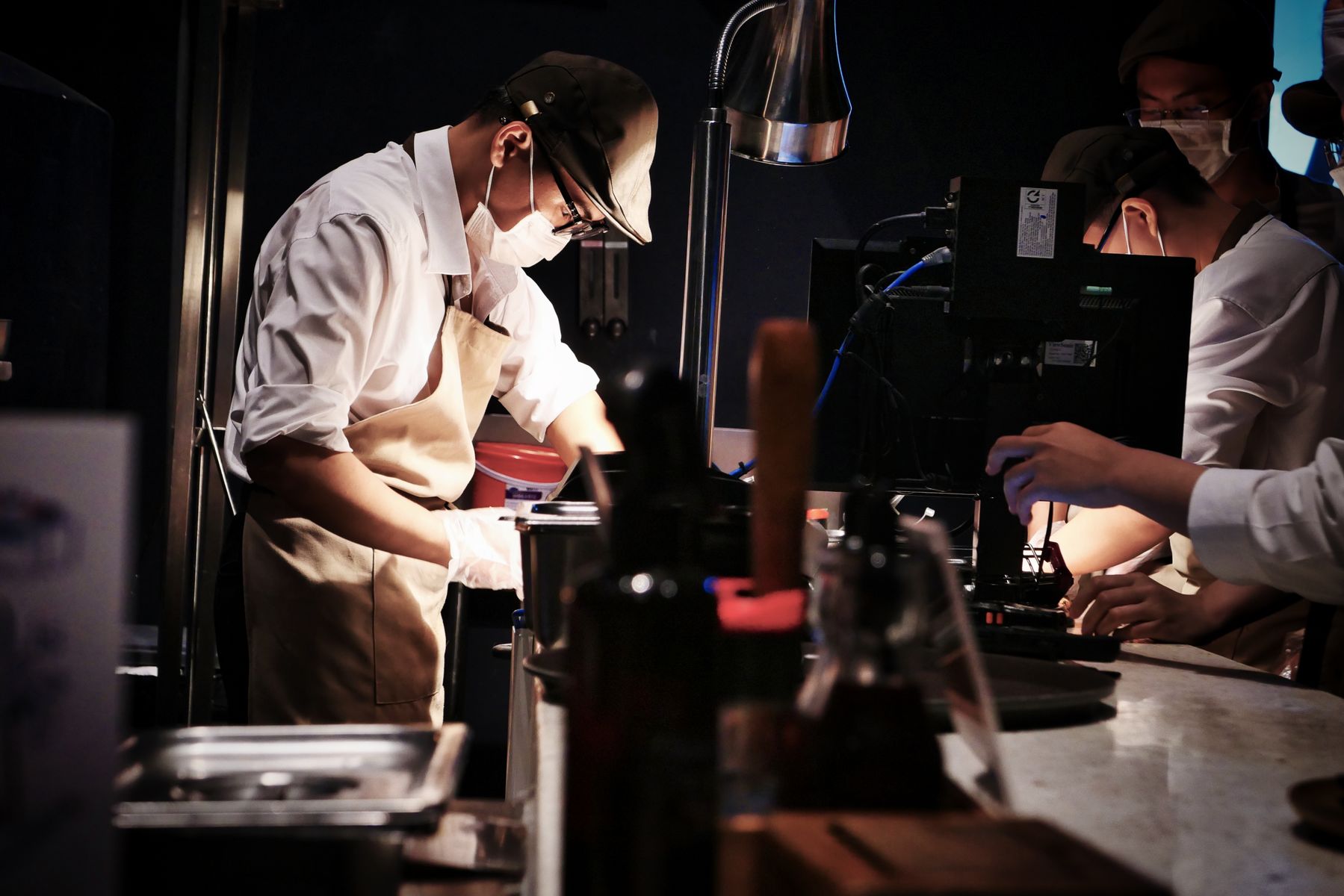
Five insight clusters from research.
The evidence converged around verification cost, trust, time, stale information, and restaurant capacity.
30–60 minutes of research before eating
Confidence changes with the person answering
Checking is slow enough to change behavior
Paper tickets and memory cannot stay current
Small kitchens cannot absorb every escalation
Who the system is designed for.
Two customer patterns and two restaurant roles expose both sides of the same safety decision.
Fast, trustworthy answers without pre-visit research
Clear Safe / Caution / Avoid evidence
Resolve questions without leaving the floor
Scannable allergen flags and honest capacity limits
What the design must achieve.
Five criteria became the test for every later interface and service decision.
- 01Respect existing roles
Route through staff, not around them
- 02Reduce verification cost
Make checking faster than skipping
- 03Match kitchen reality
Use scannable signals during service
- 04Surface the right failure
Show when a safe answer is not possible
- 05Acknowledge limits
Never imply universal capacity
An allergy order through the restaurant.
The waiter’s confidence and the chef’s capacity rise and fall at different moments during the same order.
Pain point Modification approval is slow.
Pain point Mid-service prep conflicts are hard to eliminate.
System limit Small kitchens cannot promise every substitution.
The real opportunity.
Those criteria and that journey point at one gap: what the customer already knows never reaches what the restaurant can verify and safely execute.
What the diner knows is safe before walking in.
What the waiter, manager, line cook and chef know and can do.
Three approaches considered. Two rejected.
Closing that gap could be built three different ways. Two of them still left the gap standing.
Helpful discovery, but no restaurant integration or shared truth.
Tracks allergens but leaves the customer outside the system.
Connects customer verification to live restaurant operations.
What research changed about the design.
Choosing the two-sided system was the easy part. What it actually needed only became clear once real restaurant behavior pushed back on the first version.
Direct diner-to-chef route
→AfterWaiter and manager first; chef only when needed
Every question escalated
→AfterApproved answers become reusable service knowledge
One restaurant mode
→AfterFull-service, limited-substitution, or rejection-mode
Three decisions, three rejected alternatives.
Three of those shifts came with a real cost, each chosen deliberately over an easier alternative.
Route to waiter first; escalate only when needed
Direct diner-to-chef chat
Keep severity as restaurant-owned evidence
Customer-entered severity colors
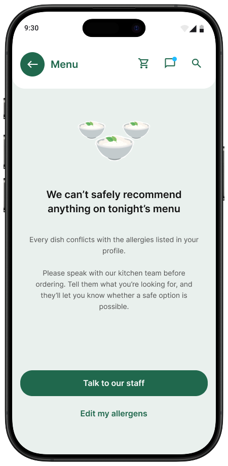
Allow kitchens to say a dish cannot be made safe
Force every request into a substitution
What those decisions became.
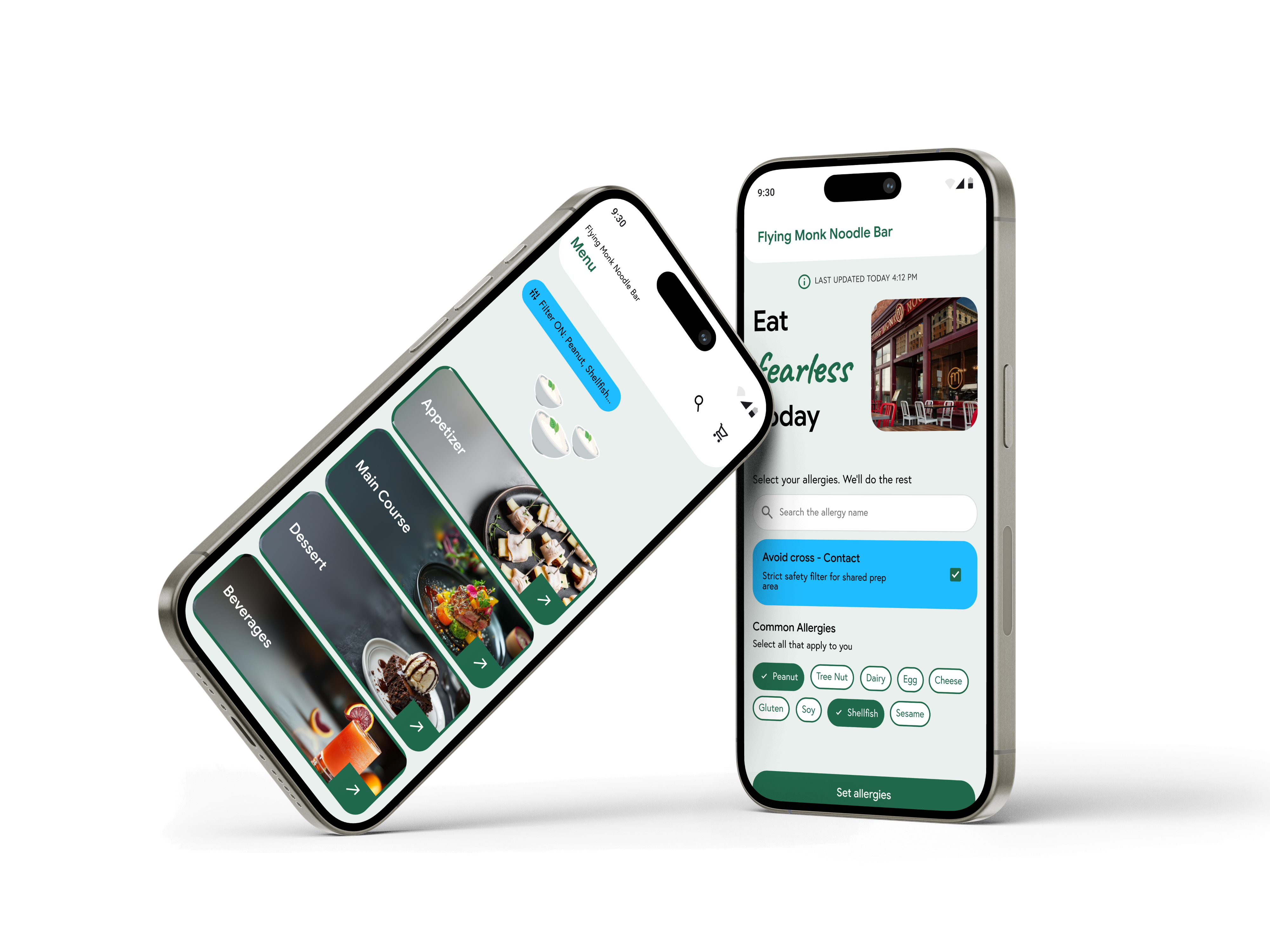
Four role-specific products read and update one allergy-and-dish record in real time.
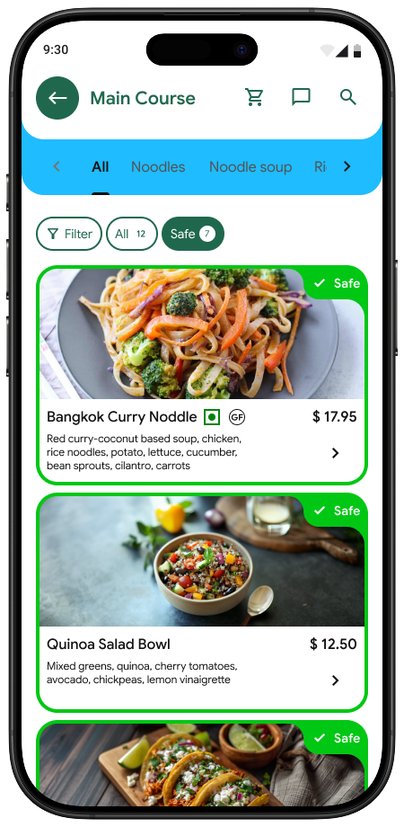
Scans QR, saves allergens, sees evidence
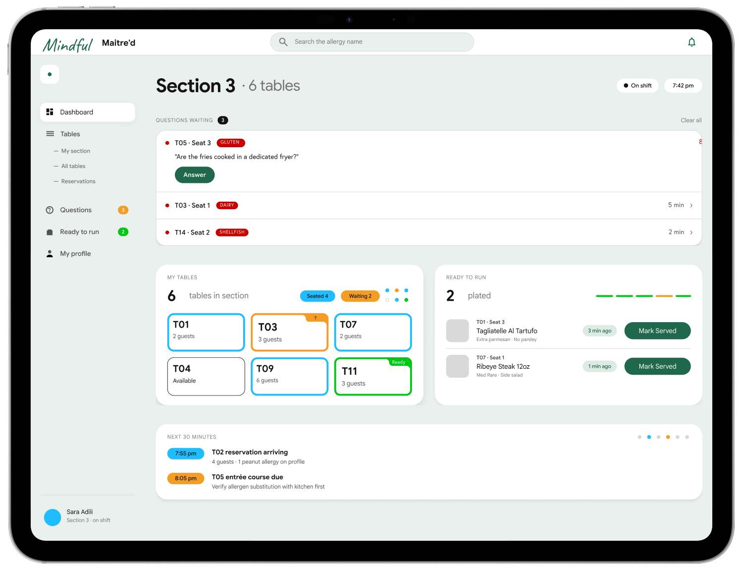
Sees guest context and routes questions
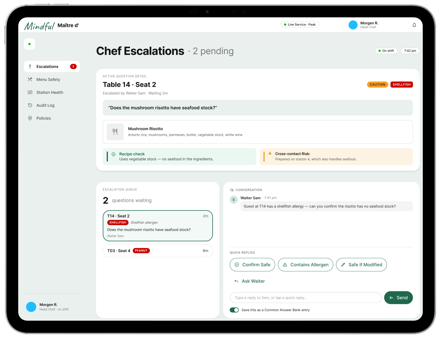
Resolves only the cases staff cannot answer
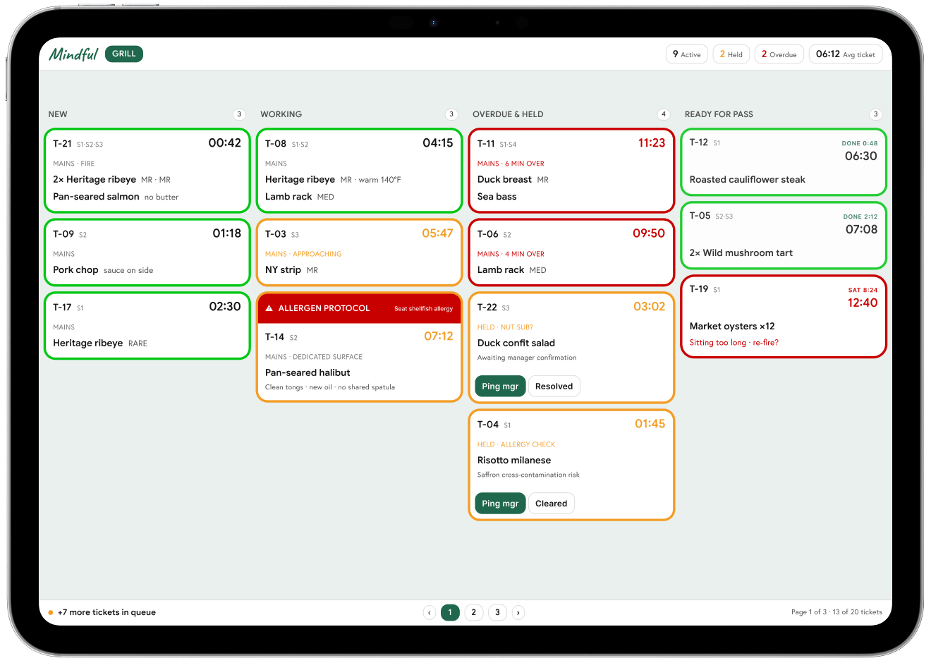
Receives an allergy flag on every prep ticket
Four views. One shared safety record.
Three states, four roles, one shared truth.
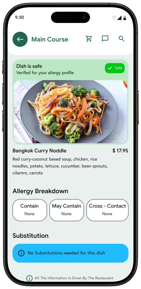
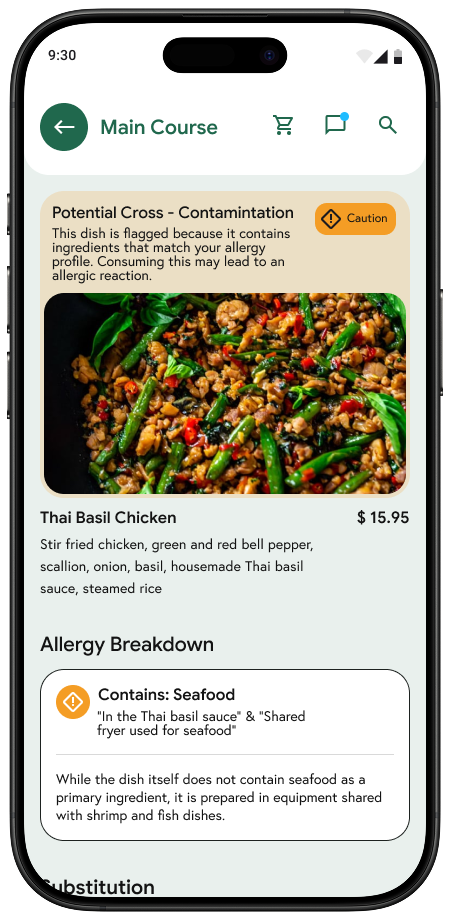
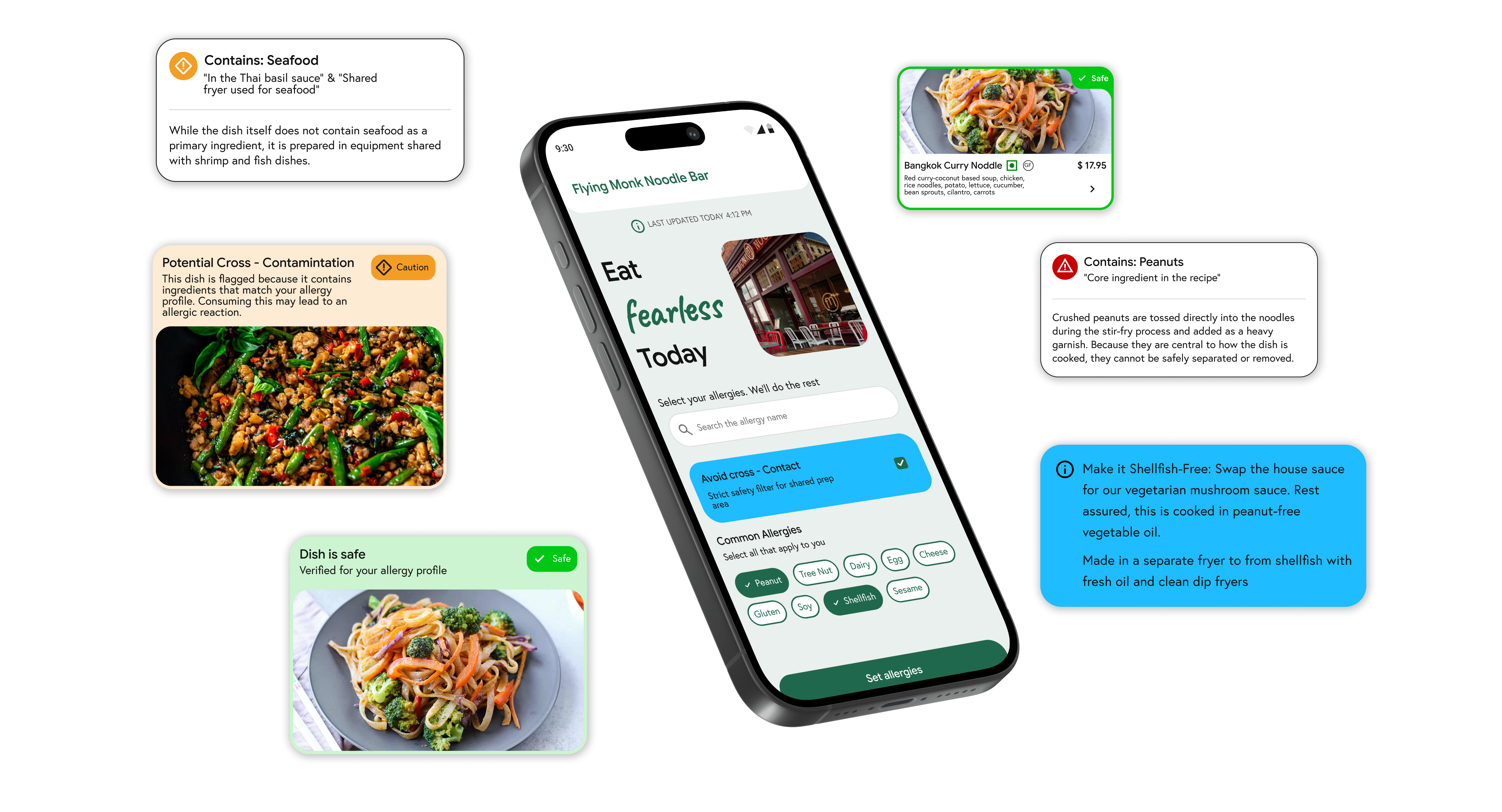
Safe, Caution, and Avoid remain consistent while each role receives the level of detail needed to act.
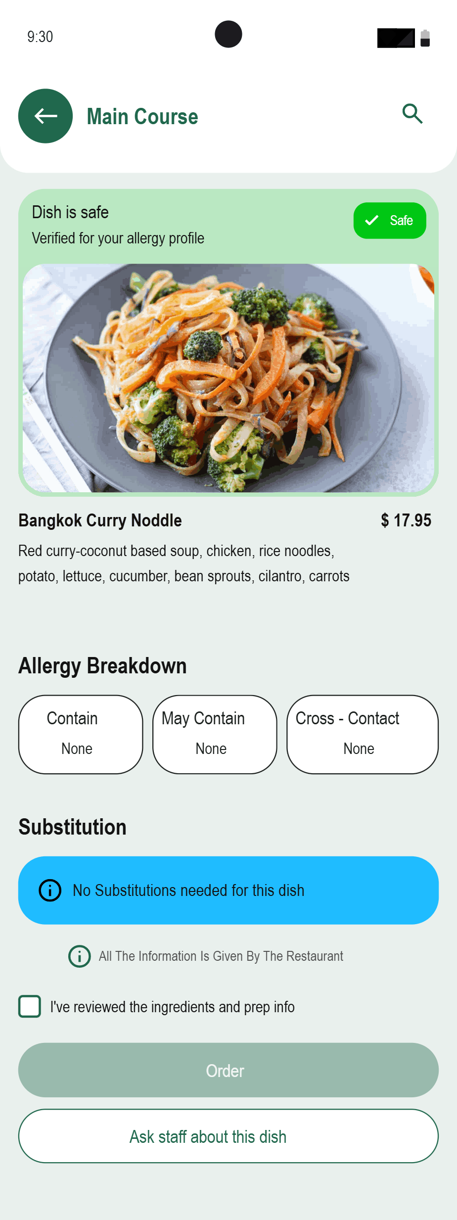
Safe
- No profile conflict
- Evidence checked
- Order unlocked
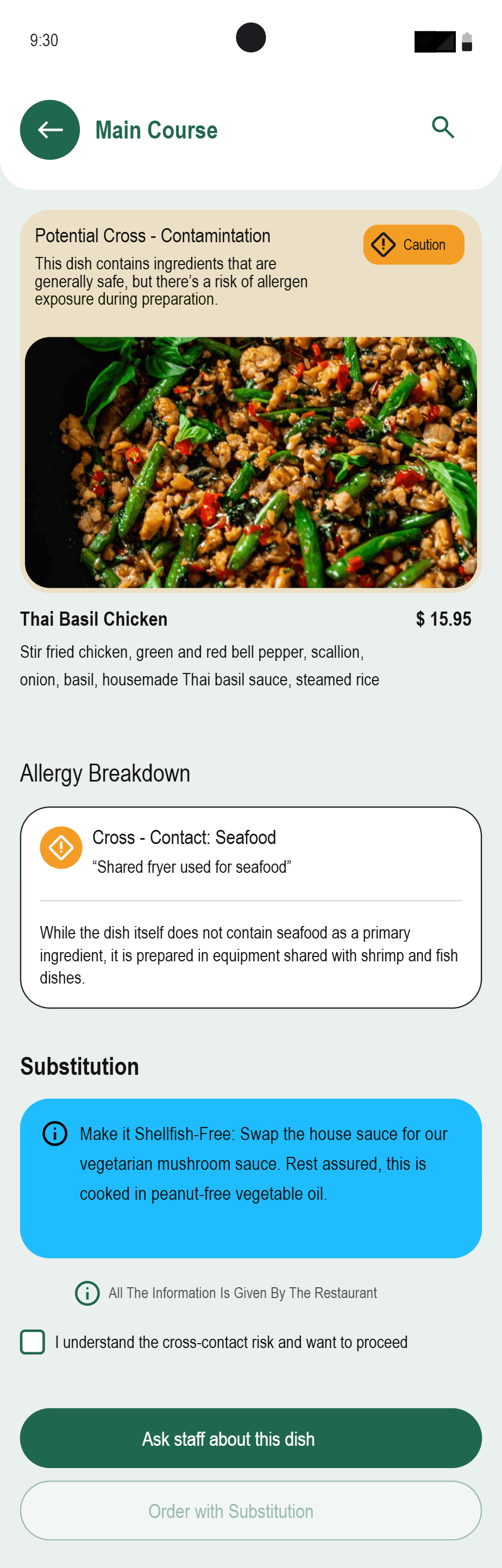
Caution
- Possible cross-contact
- Substitution available
- Review required
Avoid
- Known allergen
- Unsafe preparation
- Order blocked
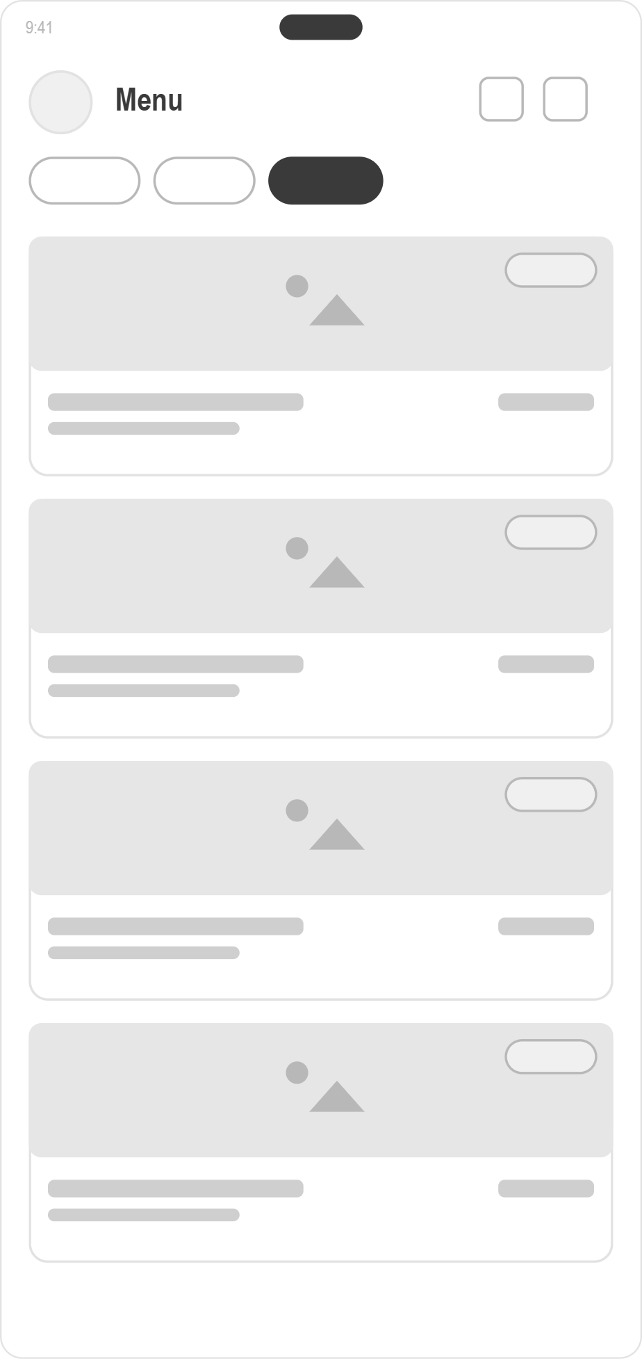
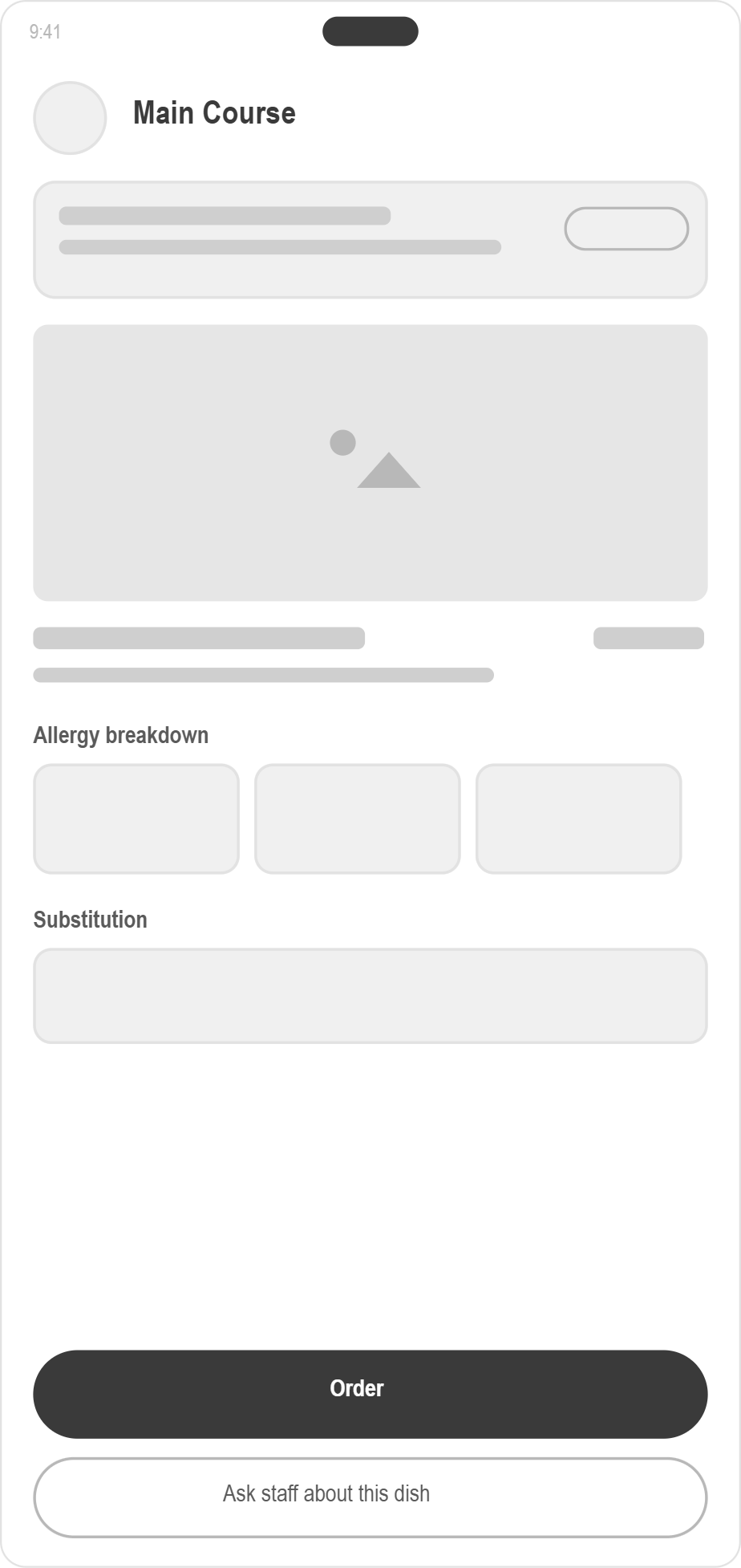
From sketches to system.
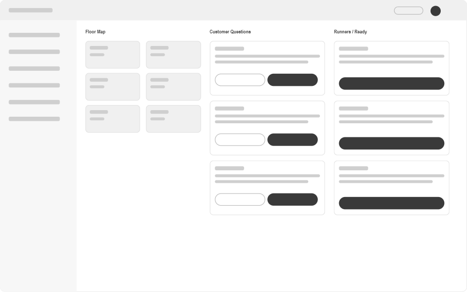
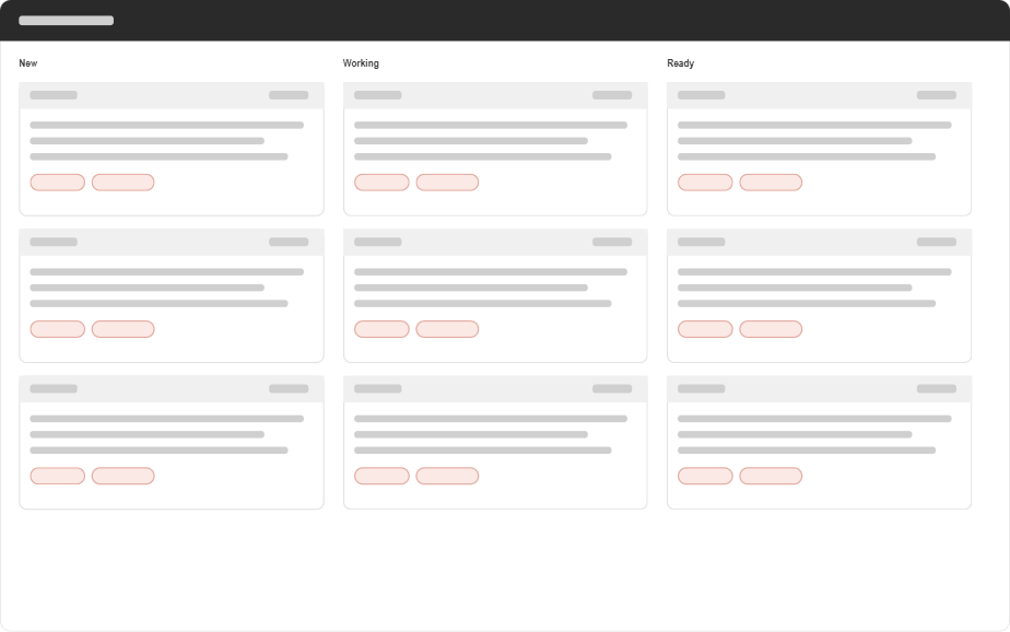
Low-fidelity flows established allergen setup, menu evidence, staff questions, and kitchen escalation before visual styling.
Design-system foundations.
Semantic safety colors, one component library, and role-aware density let the same decision travel across mobile, tablet, and kitchen displays.
Evidence checked against the diner’s allergy profile.
Cross-contact or substitution details need attention.
The kitchen cannot verify a safe version of the dish.
One question record moves through the service team.
One semantic palette across customer, waiter, chef, and line views.
Three user flows show how the system works.
The customer path, chef decision path, and customer → waiter → chef escalation preserve context from question to answer.
Flow 1 · Customer finds and orders a safe dish
- 1Set allergy profile→
- 2Open restaurant menu→
- 3Filter by verdict→
- 4Review dish evidence→
- 5Confirm safe order
Caution routes to substitution or a question. Avoid keeps ordering locked.
Flow 2 · Chef resolves an allergy risk
- 1Open escalation queue→
- 2Inspect recipe and station→
- 3Check cross-contact points→
- 4Approve, substitute, or reject→
- 5Publish decision to service
The decision also updates the kitchen ticket and reusable answer bank.
Flow 3 · Customer question → waiter → chef → customer
Swipe →Customer
Waiter
Chef
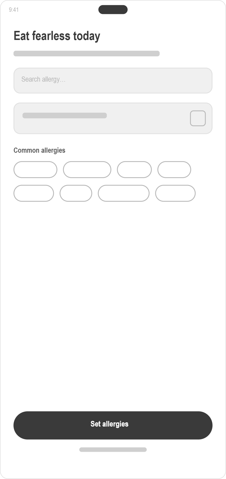
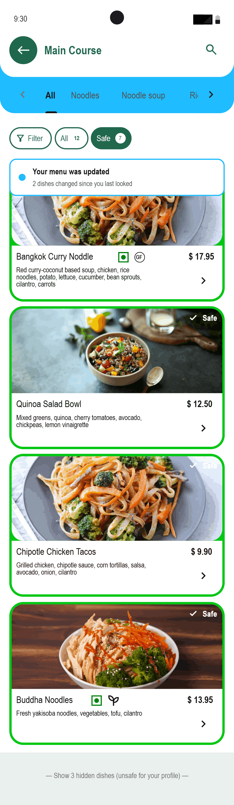
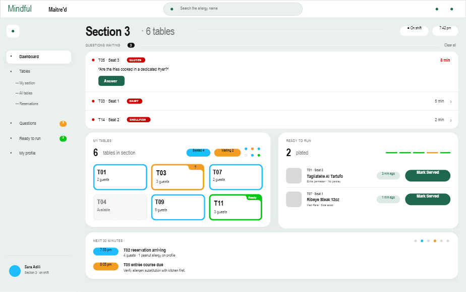
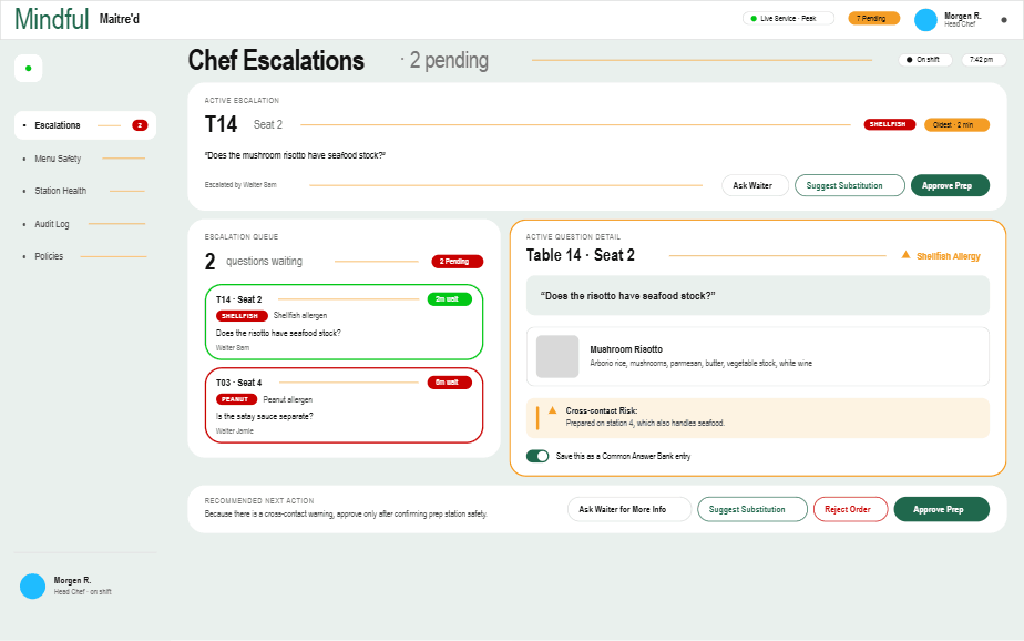
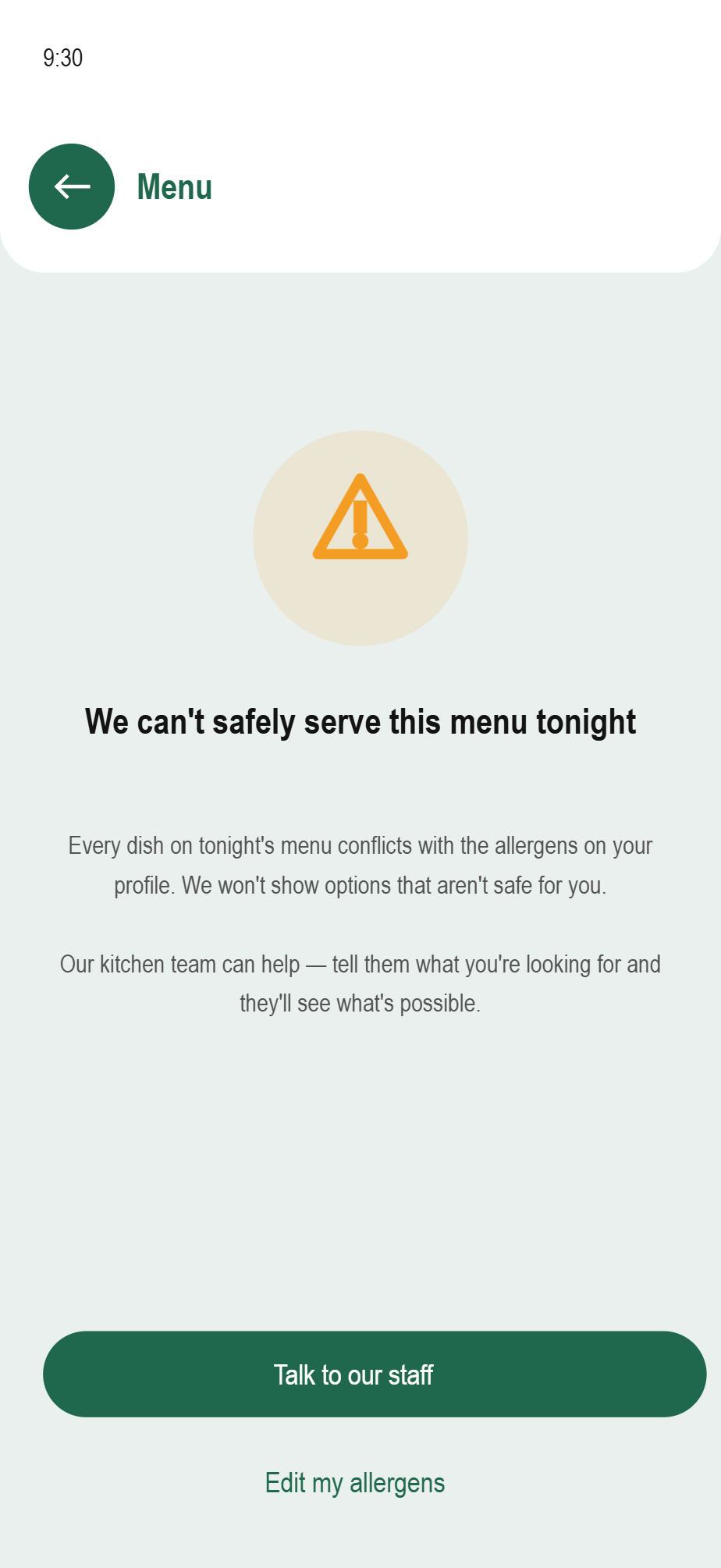
The customer experience.
Scan, set allergens, browse a filtered menu, inspect evidence, and order, or ask the kitchen.
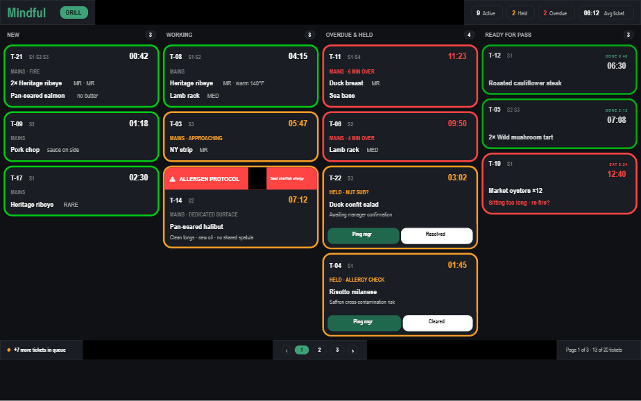
The restaurant experience.
The floor, chef, and line views reveal different operational detail while reading from the same shared record.
What testing exposed.
Usability testing changed hierarchy, routing, state distinction, and the chef’s decision controls.
Allergen labels felt detached from the dish
Move the allergen indicator onto the dish card
Faster confirmation“Ask the kitchen” felt like an end state
Turn it into a persistent pending action
Clear next stepQuestion ownership was unclear
Show a visible waiter → chef route
Shared accountabilityCaution and Avoid looked too similar
Separate amber substitution from red rejection
Safer scanningChef actions were hard to find
Prioritize approve, substitute, reject
Faster resolutionWhat the case study doesn’t usually show.
None of those three decisions survived contact with a real kitchen cleanly. Here’s what actually forced them.
The trade-offs
Every trade-off above trades speed for trust. Waiter-first routing, restaurant-owned severity, and an honest “no safe answer” all cost something up front: a slower handoff, more onboarding friction, a request the app sometimes can’t fulfill. None of them look efficient on their own. Together, they’re what makes the system something a kitchen can actually run on, instead of something that just looks good in a deck.
The uncomfortable conversation
A real chef asked why he needed to be involved at all, and I didn’t have a clean answer. Presenting the first version to a real waiter and chef was uncomfortable before a single word of feedback came back. The look on their faces said the design had blown up a kitchen flow that already worked. That discomfort is what forced the redesign: staff communication stays inside the kitchen’s existing flow, with the chef pulled in only when the waiter genuinely can’t answer.
The wrong turn
Routing customers straight to the chef looked faster on paper. It broke down in a mock service test. Cutting the waiter out of the loop seemed efficient, but tested with real waiters and kitchen staff, the kitchen got too busy, questions ended up going back through the waiter anyway, and the flow added time instead of saving it. That failure shaped the current design: staff communication stays inside the kitchen’s existing flow instead of replacing it.
What I’d do differently today
I’d start with the kitchen, not the diner. The process began with the customer-facing menu and worked backward into restaurant operations, which is part of why the first kitchen-facing direction landed as a disruption. Starting with the system the kitchen already runs on, paper tickets and staff memory, would make the eventual customer experience something the kitchen absorbs instead of reacts to.
How the system is structured.
Customer and restaurant surfaces remain separate at the interface level and connected at the safety-data level.
Diner app
Server dashboard
Kitchen line
Chef console
What success would look like.
These are transparent projections from the case-study model, not shipped metrics or measured outcomes.
Estimated waiter time recovered per shift
Hungry walk-in workaround reduced
Estimated menu verification time
Estimated reduction in reaction incidents
Directional estimates from the case-study model, not measured product outcomes.
Learnings, reflection, and what comes next.
The project’s strongest lesson is about behavior and restaurant systems, not interface polish.
What I learned
Restaurant design is a systems problem before it is an interface problem.The most valuable finding came from watching one person do something she had not mentioned in an interview. Behavior changed the system more than another polished screen would have.
- 01Reservation-side capture
Attach an allergen profile before arrival so the kitchen can prepare.
- 02Direct waiter calling
Let a guest summon the floor team without bypassing service roles.
- 03Real restaurant pilot
Validate adoption, saved-answer governance, and peak-service capacity.
The project is the handoff.
Forkast succeeds only when one evidence-backed decision survives the journey from the diner’s phone to the kitchen and returns without losing context.